Quick Start Guide
In-depth guide about different configurations of image source.
When you log in to Gumlet, you will be redirected to Image Overview:
The new Image Dashboard is designed to help you get started quickly, so you save those GBs and we load your website & apps faster.
Do more with the image dashboard:
- Tutorial videos
- Create more image sources
- Get usage analytics for the current month
- Get source-wise consumption for the current month
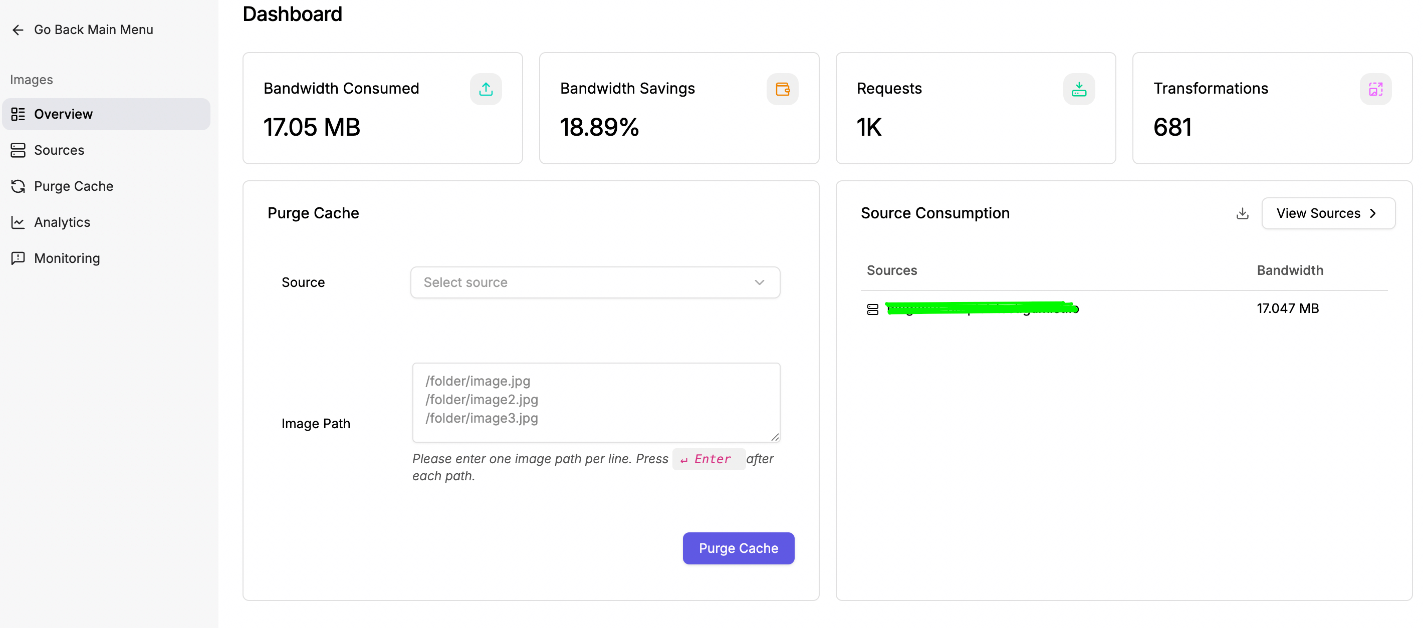
Image Overview
Tutorial video to create an image source
Add Source
Creating an image source is the first step toward delivering optimized images. The image source provides Gumlet with information on how to fetch your original image and offers various configuration options.
Navigate to https://dash.gumlet.com/image/sources and create a new source.
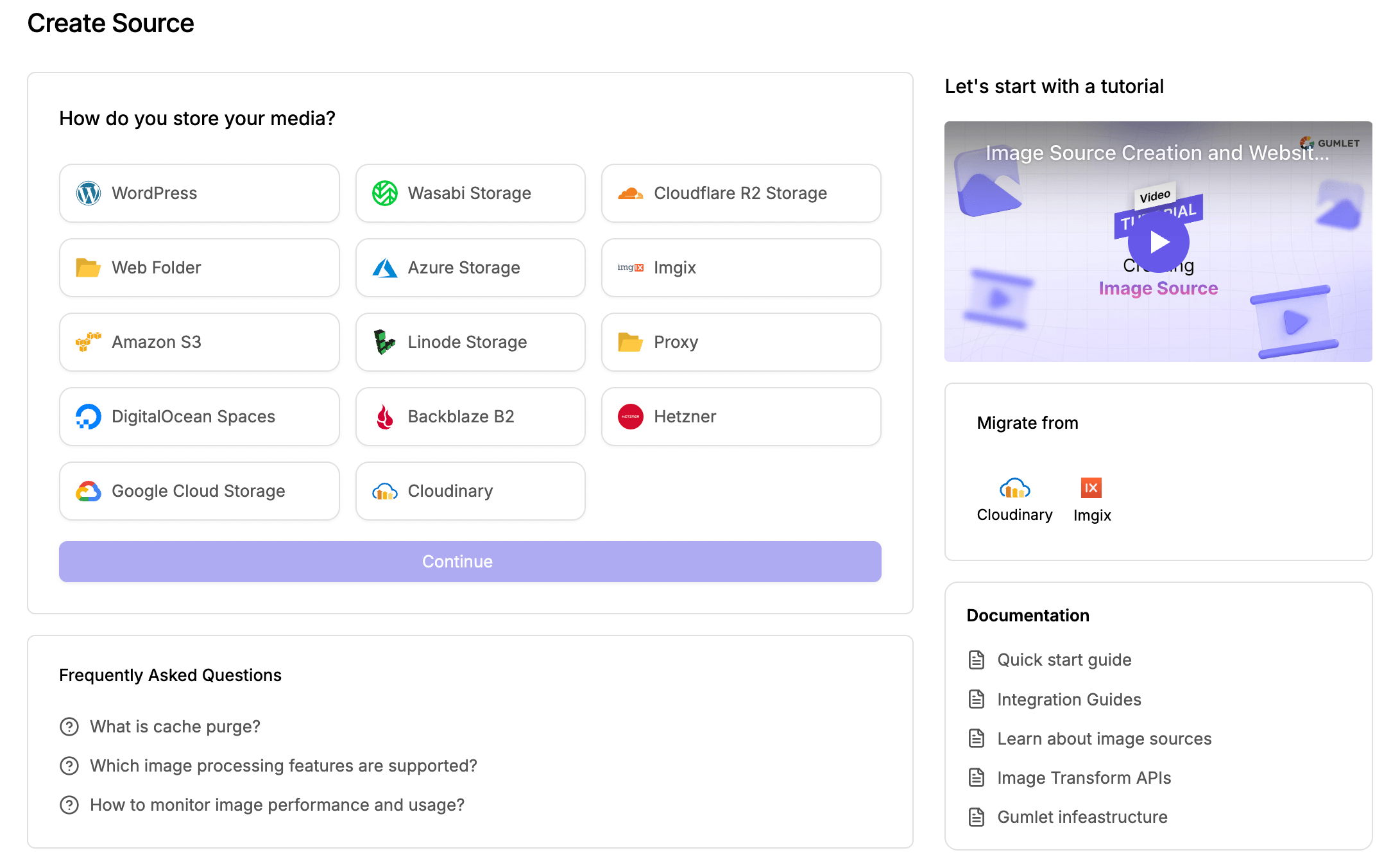
Select your original image storage to continue
Source Types
You can select from different source types depending on your current setup. Each source type has different storage backends supported, and at the end of source creation, you will get a full guide on setting up image delivery most efficiently.
You can refer to our Original Media Storage guide to check supported storage backends.
Check out WordPress, Next.js, React.js and App integration guide here.
Installation
The best and easiest way to install gumlet.js is by including it in <head> section of all your pages.
<script type="text/javascript">
    window.GUMLET_CONFIG = {
        hosts: [{
            current: "{{example.com}}",
            gumlet: "{{mysubdomain}}.gumlet.io"
        }],
        lazy_load: true
    };
    (function(){d=document;s=d.createElement("script");s.src="https://cdn.jsdelivr.net/npm/[email protected]/dist/gumlet.min.js";s.async=1;d.getElementsByTagName("head")[0].appendChild(s);})();
</script>
Please replace {{mysubdomain}} in the above code to the subdomain created by you on Gumlet. Please also replace {{example.com}} with the domain from where images are currently being served.
Once the above steps are complete, your users will automatically start getting responsive images! Yes, it's that simple.
However, we recommend making the following changes to <img> tags to make images even more optimized.
Rename img src="" to data-src=""
img src="" to data-src=""If you are currently serving images from a CDN or your web server, the chances are that you would have all <img> tags with src attributes. We recommend you change them to data-src attributes. For example:
<!-- Current image tag -->
<img src="https://demo.gumlet.io/logo.png" alt="Gumlet Logo">

<!-- Image tag required for Gumlet -->
<img data-src="https://demo.gumlet.io/logo.png" alt="Gumlet Logo">
If you don't do this step, whenever a user loads a page, the browser will request an image available in the src attribute, and as soon as gumlet.js processes it, the request is canceled. This is very inefficient and should be avoided. Once you set the data-src attribute, gumlet.js will ensure that the browser loads only the required image, and no extra requests are made to the server.
For more integration options, navigate to Integration Guides.
Gumlet is live now!This is all that was needed to deliver responsive images to your users.
Serving Static Files
It is super easy to serve other static files (like JavaScript, CSS files, PDFs, etc) via CDN using Gumlet. All you need is a valid Gumlet subdomain.
The next step is to replace the hostnames in the URLs of your static files with the Gumlet subdomain in your web application. Check if your static files https://example.com/css/mycssfile.css are accessible via your Gumlet subdomain https://example.gumlet.io/css/mycssfile.css.
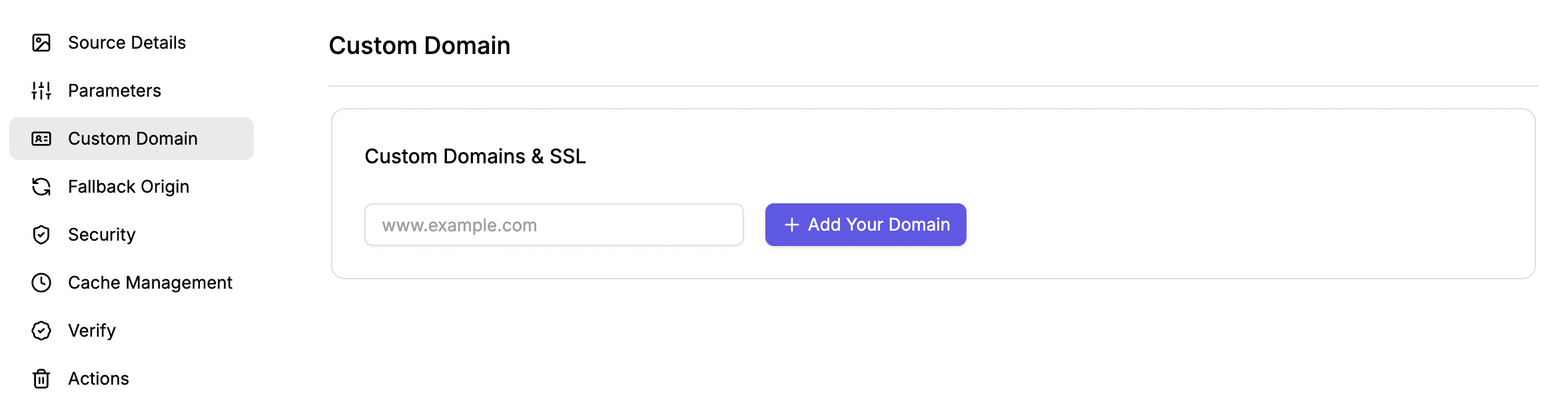
CDN & Custom Domain
Gumlet will utilize a content delivery network (CDN) to accelerate the delivery of your images and other static files. All paid plans come with free custom domains, check out pricing here. For additional custom domains, a monthly charge of $ 5 per domain applies.
Go through this document for more information on a custom domain.
Updated 7 months ago